The Power of Visual Consistency in Game Worlds
21 April 2026
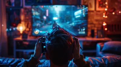
Ever walked into a game world that felt like someone threw spaghetti at a wall and called it a map? Yeah, been there. It's jarring. Your brain goes, "Wait, what era are we in? Why does this medieval castle have neon lights and a vending machine?" That, dear reader, is a classic case of a game suffering from a lack of visual consistency.
But when it’s done right? Oh man, it’s like slipping into a dream that just flows. The visuals, the lore, the UI – everything works together like a perfectly tuned orchestra. So, buckle in, fellow gamer (or dev, or just curious human), because we’re diving deep into the magical, pixel-paved roads of visual consistency in game worlds.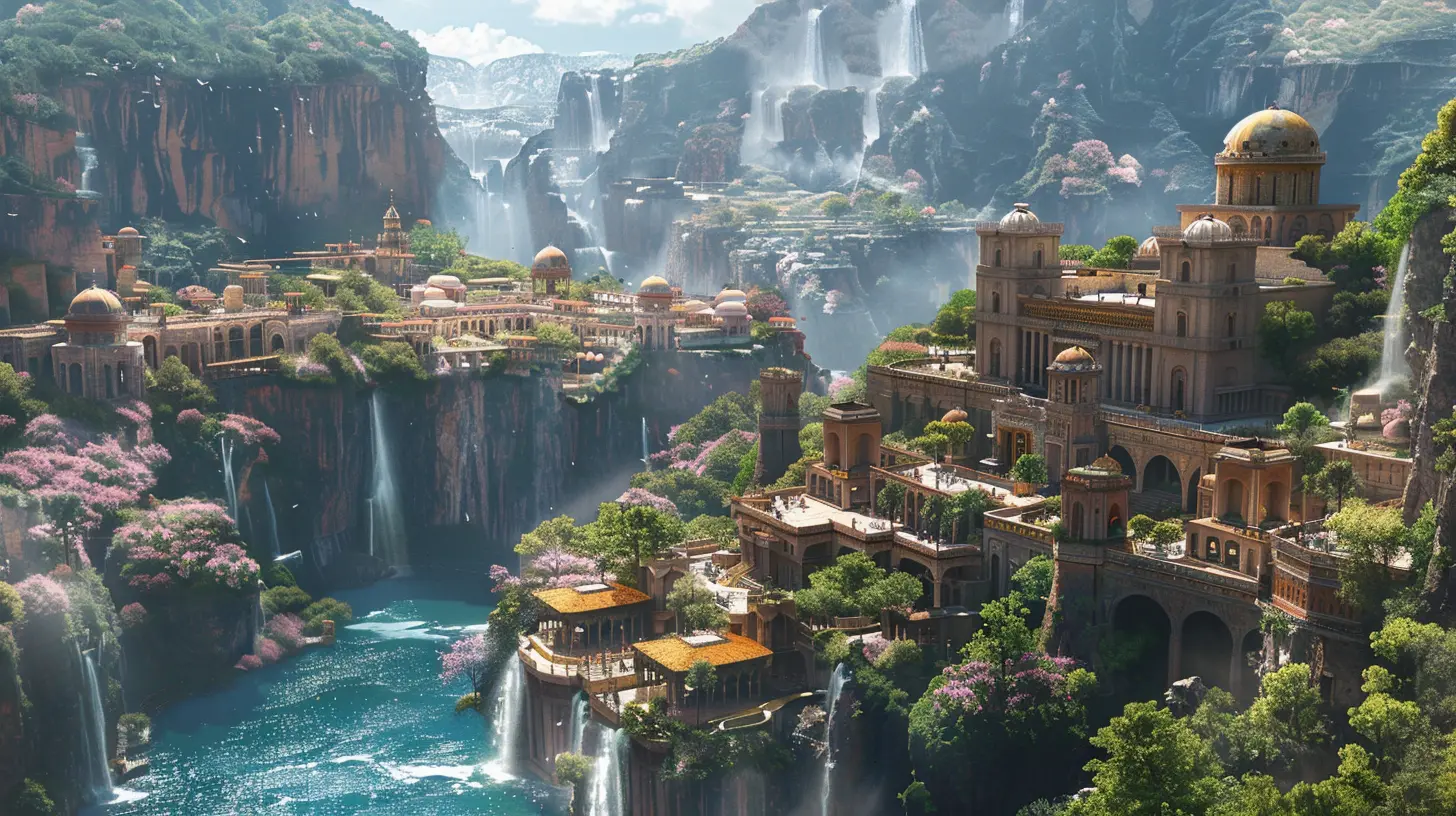
What's Visual Consistency Anyway?
Visual consistency in games means making sure that everything you see on screen – from characters to environments to UI elements – feels like it belongs in the same universe. It's like wearing matching socks. Technically you don't have to, but it feels so much better when you do.Imagine if The Legend of Zelda: Breath of the Wild suddenly featured hyper-realistic 4K textures for just one tree. You’d notice, right? That tiny inconsistency messes with immersion – the holy grail of gaming experiences.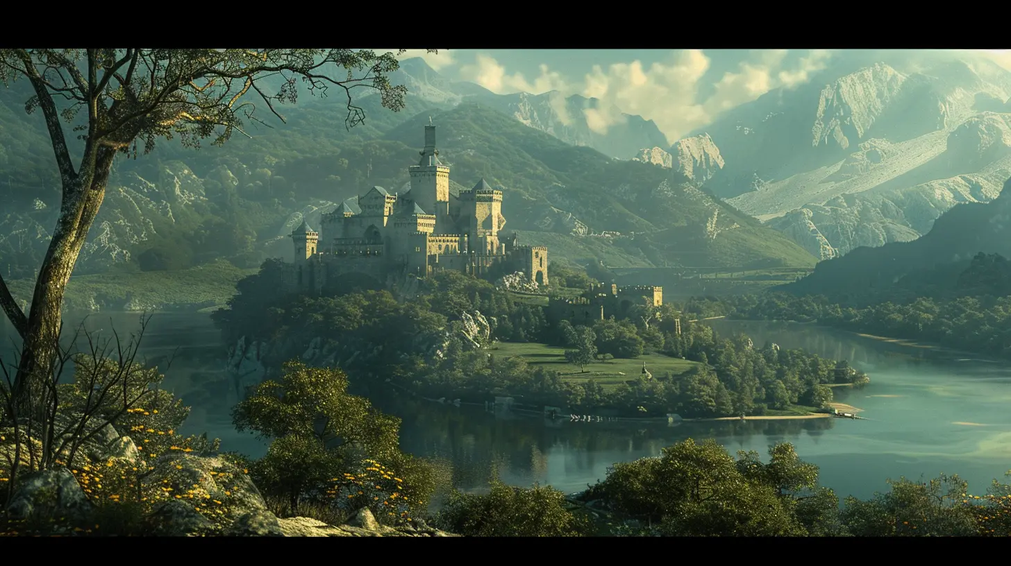
Why Visual Consistency is a Big Deal
You know that feeling when you’re so into a game that you forget what time it is, forget dinner, and suddenly it’s 3 AM? That’s immersion. And visual consistency is one of the biggest keys to achieving it.When a game world "makes sense visually,” your brain doesn’t stop to question what it's seeing. It just plays. The experience becomes seamless, believable, and way more enjoyable.
Here’s What Visual Consistency Impacts:
- Immersion – The player stays inside the world you’ve built.- Storytelling – Visuals support the narrative without fighting it.
- Gameplay Clarity – Consistent design helps players understand what’s interactable and what’s not.
- Emotional Impact – The right visual tone enhances the mood and helps build connections.
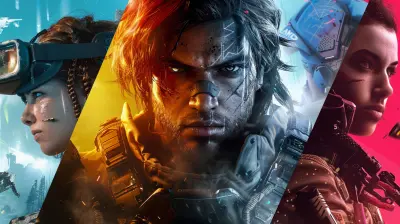
Examples: When It All Comes Together
1. Hollow Knight
Let’s talk about Hollow Knight. This indie darling is the poster child for visual consistency. The gloomy, bug-filled world of Hallownest is painted with smooth 2D art that’s both stylized and coherent. From the soft lighting to the hand-drawn characters and even the menu screens — everything screams “this world has a soul.”Nothing feels out of place. Even the enemies, from the tiniest crawling critter to the towering bosses, match the visual language of the game. That’s consistency, baby.
2. The Witcher 3: Wild Hunt
Oh, The Witcher 3. If loving you is wrong, we don’t want to be right. The game nails the gritty, realistic aesthetic in every nook and cranny. Armor glistens just so, the lighting sets the mood in each region, and monster design sticks to the game’s dark fantasy roots.Geralt wouldn’t look half as badass if the game didn’t commit so entirely to its visual theme. And let’s not forget those beautiful oil paintings used in cutscenes – same style, same game world, different medium. Genius.
3. Journey
Ever played Journey? It’s basically visual consistency in motion. The art direction is minimal, but it still tells a profound story. The environment, the character’s design, the color palette—they’re all in perfect harmony. Even the UI barely exists, and that’s the point.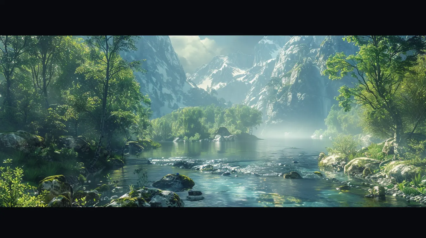
When Games Go Visual-Whack: The Cautionary Tales
Let’s be nice. We won’t name names (okay, maybe just a few for fun). But some games try to mix too many art styles or visual themes and end up looking like a fever dream after a cheese binge.1. Too Many Cooks in the Art Department
Sometimes teams just toss in every cool idea ever, thinking more is more. But unless you’ve got some serious design glue holding everything together, it ends up looking like a visual ransom note.2. Clashing UI and Game Aesthetics
You’re playing a post-apocalyptic survival game, everything is grim and bleak… then the inventory screen pops up and it looks like it was borrowed from a cartoon. Nope. Big nope.The Secret Sauce: How Devs Pull It Off
Let’s peek behind the curtain. How do developers make visual consistency happen?1. Setting a Visual Style Guide
Game devs often create a “visual bible.” It’s a document filled with rules and references for everything from color usage to character proportions to texture resolutions. Basically, it’s the gospel according to Art Director.2. World-Building First, Assets Later
The best visuals are born out of strong world-building. Devs ask questions like: What’s the history of this world? What kind of materials would buildings be made from? Would people have fashion or just functional clothes?Answering these questions early ensures that everything from street lamps to sword hilts fits the world.
3. Consistent Lighting and Color Palette
Lighting is more than just making things visible. It sets mood, guides the player, and ties everything together. Like how horror games love dim, flickering lights while fantasy RPGs prefer soft, natural lighting with dramatic shadows.Color palette also plays a huge role. Games like Firewatch use a specific warm-toned palette that instantly makes screenshots recognizable.
UI Matters Too (Yes, Really)
You might think UI is just the boring bits – menus, health bars, inventory. But oh boy, can it break immersion if it doesn’t match the rest of the game.Imagine playing a gritty ninja stealth game... and your pause menu looks like it belongs in a sci-fi space shooter. It’s jarring. UI should compliment the visual tone, not clash with it.
Great UIs disappear. You don’t “see” them because they feel like a natural part of the world. That’s the goal.
The Role of Animation & Effects
Ever noticed how a clunky animation can make even the prettiest game feel off? That’s because animation is part of visual consistency too. The way characters move, attack, jump – even how objects explode – needs to align with the game’s visual theme.A cartoony explosion in a hyper-realistic war game? Yikes.
Particle effects (smoke, fire, magic sparkles) also need to match the art style. Stylized games often lean into bold, exaggerated effects. Realistic games go for subtle and accurate.
Indie Games vs AAA: Who Does It Better?
Trick question. Both do it incredibly well… when they care enough.- Indies often rely on a single, tightly controlled art style to keep production manageable. That sometimes leads to sharper visual consistency.
- AAA games have the resources to implement huge amounts of high-quality assets while maintaining a cohesive look – assuming they’ve got a strong art director at the helm.
The takeaway? Budget helps, but vision matters more.
Why Players Care (Even If They Don’t Know It)
Here’s the kicker – most players can’t quite articulate why a game feels immersive or why another one feels “off.” But they feel it. That’s the power of a visually consistent world. It creates vibes. It builds trust. It lets players lose themselves in your world without tripping over a neon palm tree in a desert wasteland.Final Thoughts: Respect the Power
When game devs respect visual consistency, they respect the player. They’re saying, “Hey, we cared enough to make every corner of this world feel real.” And honestly? Players notice. Maybe not consciously, but they feel it in their gamer bones.So the next time you're wandering through the windswept plains of a fantasy world or glitching through cyberspace with neon-drenched shades, take a moment to appreciate the unsung hero: visual consistency.
It’s not the flashiest feature, but it just might be the most powerful one.
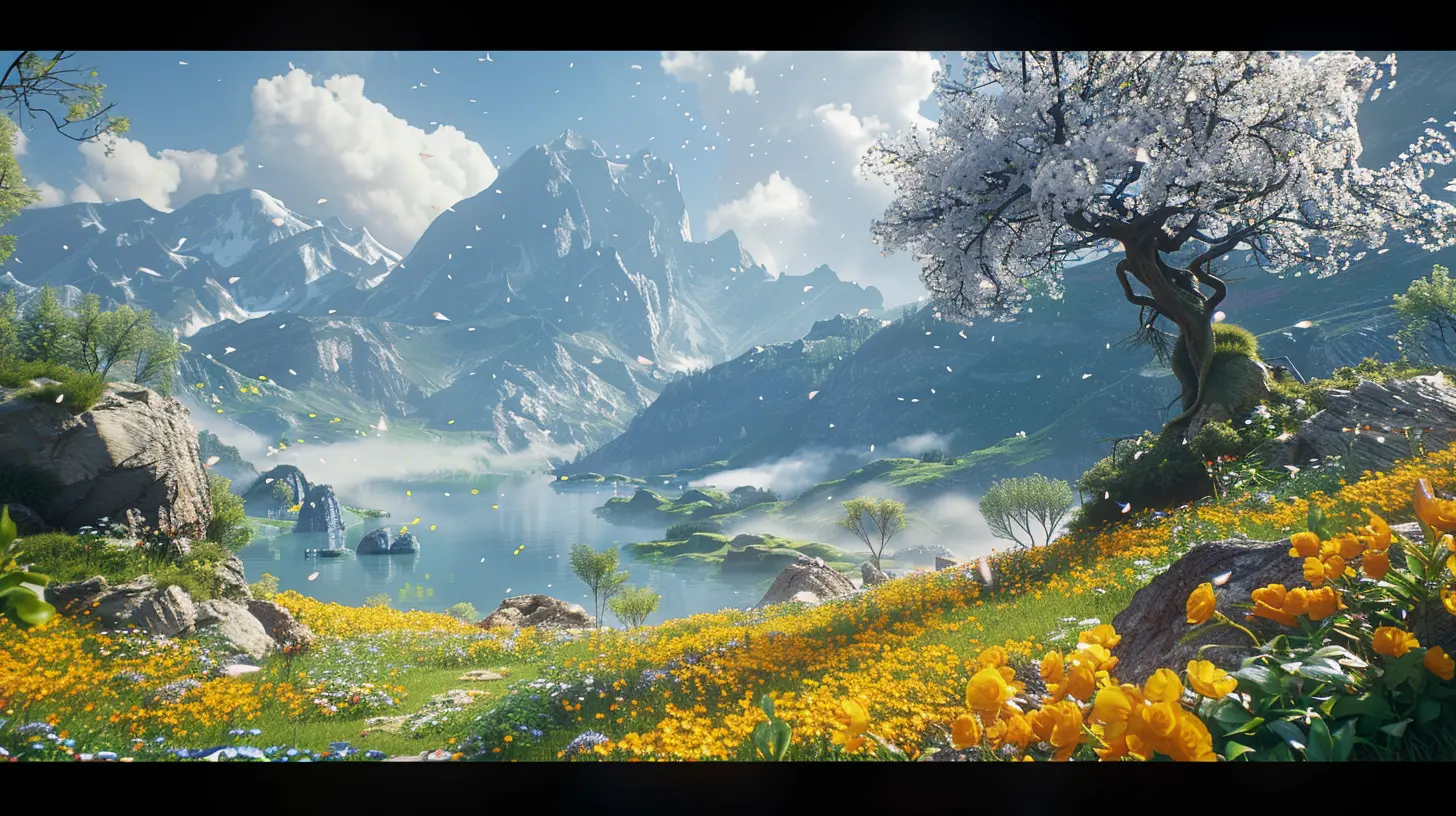
all images in this post were generated using AI tools
Category:
Game Content CreationAuthor:

Jack McKinstry
Discussion
rate this article
2 comments
Pierce Roberts
Visual consistency can elevate immersion but risks stifling creative diversity.
May 6, 2026 at 4:30 AM
Jack McKinstry
That's a great point. Balancing visual consistency with creative diversity is key to crafting memorable game worlds. It's all about finding that sweet spot.
Serenity Gibson
Visual consistency transforms chaotic landscapes into immersive realms—it's the magic behind unforgettable gaming.
April 25, 2026 at 3:08 AM
Jack McKinstry
I completely agree. Visual consistency truly elevates the gaming experience, making worlds feel alive and cohesive. It's that attention to detail that keeps players engaged.