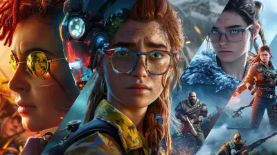
How to Use Color to Guide Player Emotions
3 February 2026
Have you ever been so immersed in a game that you felt the tension rising before anything actually happened? Or maybe you felt completely at peace trekking through a beautifully lit forest in an adventure game and didn’t realize why? That, my friend, is the power of color.
Color isn’t just there to make things look pretty. It’s a silent storyteller. Without saying a single word, color can whisper fear into your heart, fill you with excitement, or even lull you into a sense of calm before the storm hits. Game developers and artists are like emotional architects, and color is one of their most powerful tools.
So buckle up, because in this article, we’re diving deep into how you can use color to guide player emotions. Whether you’re building a moody horror game, crafting a lighthearted platformer, or designing a thought-provoking indie piece, understanding color theory and emotional response is a total game-changer.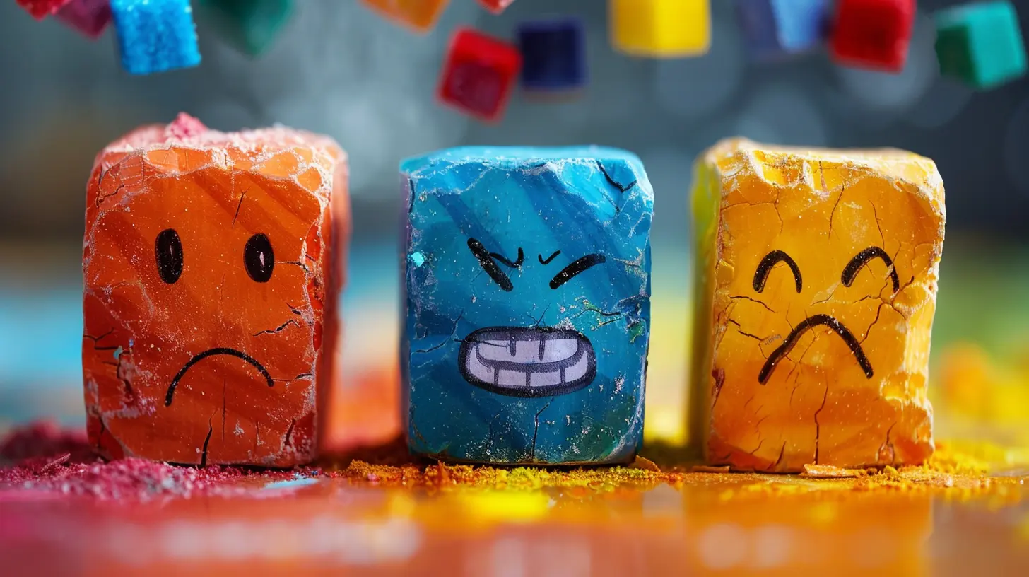
Why Color Matters in Game Design
Let’s keep it real—when we think of color in games, most of us picture vibrant landscapes or cool character outfits. But beneath the surface, color does so much more than just decorate the environment.Color sets the mood. It guides our feelings. It even tells us how to react before we fully understand what’s happening on-screen.
Think about the last horror game you played. Was it drenched in desaturated greys and eerie greens? Or how about a charming farming sim that made you feel warm and fuzzy with soft pastels?
Those choices weren’t accidents.
In simpler terms, color is emotional shorthand. You don’t need to spell out danger if the player feels it coming. And that’s the sweet spot color can hit.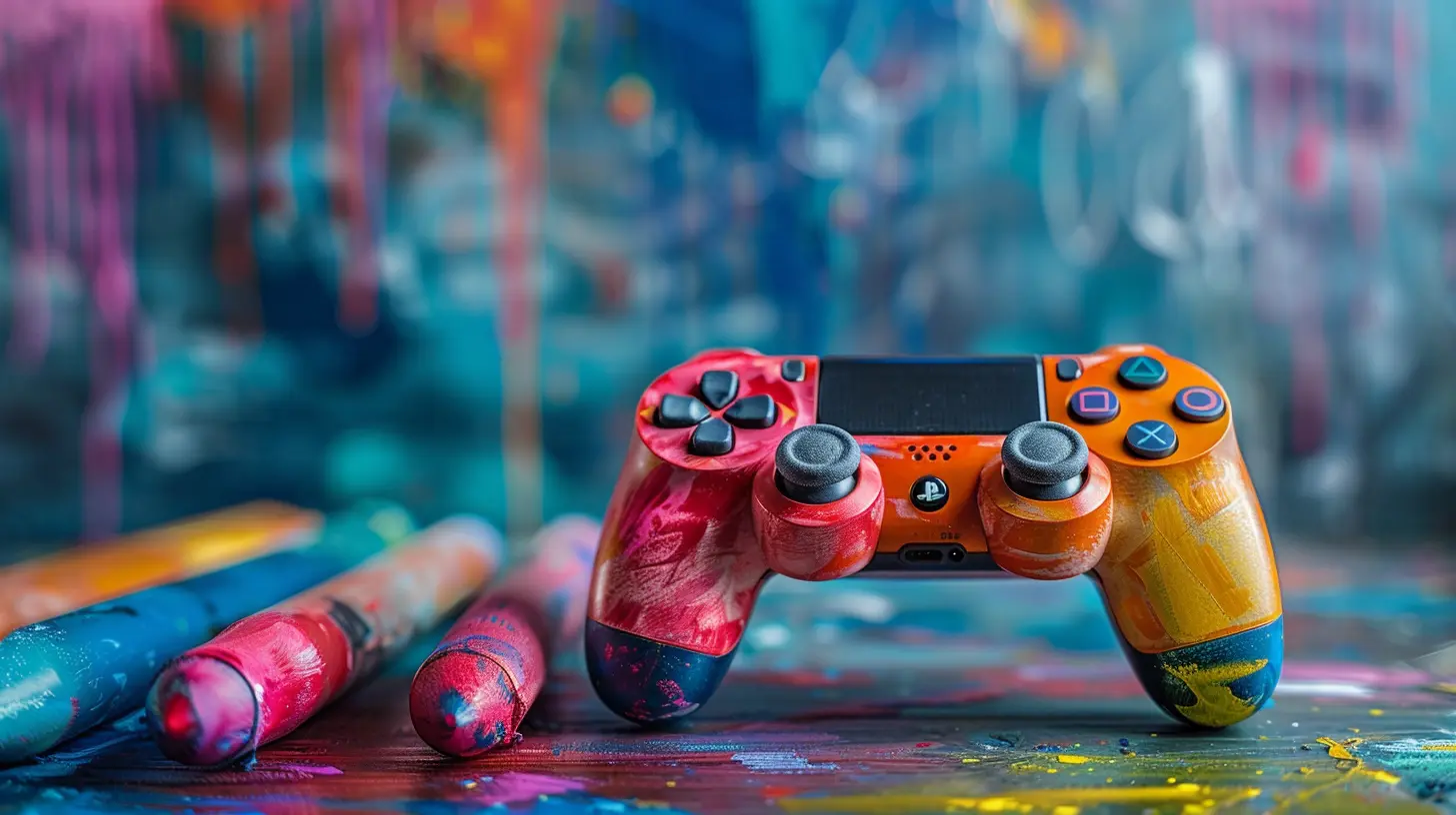
Color Theory 101 (Don’t Worry, It’s Not That Boring)
Before we start throwing shades around like confetti, let's go over some basics. Don’t worry—this won’t feel like art school homework.Primary Emotions and Color Associations
Colors can trigger emotional responses based on psychological and cultural associations. Here are some classic color-emotion pairings:- Red: Passion, excitement, anger, danger
- Blue: Calm, trust, sadness, loneliness
- Yellow: Happiness, energy, caution
- Green: Growth, peace, envy, decay (yeah, it’s a tricky one)
- Purple: Mystery, magic, luxury
- Black: Power, fear, death, elegance
- White: Purity, hope, coldness, emptiness
But here’s the catch—context is king. A dark red in a fantasy game might scream “evil sorcerer,” while the same red in a racing game might just mean “go faster!”
Colors don’t work in a vacuum. Their emotional impact depends heavily on their environment, lighting, saturation, contrast—and what the player has already been conditioned to expect.
Color Palettes: Creating Emotional Atmospheres
Ever walked into a room and instantly felt a vibe? That’s exactly what color palettes do in games. They set the tone before a single line of dialogue or note of music plays.Warm vs. Cool Palettes
- Warm Colors (Red, Orange, Yellow): These evoke energy, urgency, optimism—or sometimes aggression, tension, and discomfort.- Cool Colors (Blue, Green, Purple): These are typically more relaxing and calm, but can also feel isolating, melancholy, or eerie depending on context.
Let’s say you’re designing a boss fight arena. You might choose a red-orange palette to crank up the intensity. But flip the story—if your game has a healing garden for players to recover, soft greens and cool blues would be a better fit.
Monochromatic vs. Contrasting Palettes
Monochromatic scenes (shades of similar colors) often feel more unified and controlled. Great for meditative or dreamlike sequences.Contrasting colors (like blue and orange) create tension and excitement. They make scenes pop and draw the eye to specific areas—super useful for action sequences or when you need to guide the player’s focus.
Directing Emotion Through Level Design
Color is a narrative tool, not just decoration. Great game levels use color to subtly tell you how to feel without spelling it out.Example: Journey
In Journey, the desert is washed in soft oranges and golds, evoking awe and isolation. As you climb the snowy mountain, colors shift to cold blues and whites, reinforcing feelings of struggle and hardship. There’s barely any dialogue, but you feel the emotional arc because of the colors.Color as a Narrative Cue
Use color to:- Signal emotional shifts (e.g., blue to red during rising tension)
- Highlight objectives or interactive items
- Set expectations (dark green forest might mean danger lurks)
- Surprise the player (bright colors in a horror game? Creepier than pitch black sometimes!)
The human brain picks up on visual cues fast—like, lightning-fast. If used well, color can tip off a boss fight, a plot twist, or even a safe zone, all without ever breaking immersion.
Using Lighting and Saturation to Manipulate Mood
Okay, so we know color means emotion. But how it’s lit matters just as much.Brightness and Contrast
- High Brightness + High Saturation: Energetic, joyful, sometimes chaotic- Low Brightness + Low Saturation: Moody, serious, often somber or scary
Ever notice how horror games often feel “washed out?” That’s desaturation at work. It strips away comfort and makes environments feel bleak and unnatural.
On the flip side, stylized games like Animal Crossing thrive on bright, oversaturated colors to keep everything cheerful—even when it’s raining.
Dynamic Lighting
Changes in lighting can mimic emotional beats in real-time. Want players to feel vulnerable or hunted? Drop the lights, increase the shadows, mute the color. Want to pump up excitement? Flash vibrant lights during an action sequence.Lighting is like a dimmer switch for feelings.
Emphasizing Color Psychology in Character Design
It doesn’t stop with environments. Characters carry color-coded emotional baggage too.Heroes vs. Villains
An icy-blue, stoic knight gives off a very different vibe from a fiery-red rebel leader, right?And everyone remembers the big bad dressed in sinister blacks and purples. Those choices clue players in long before any monologue.
Characters are emotional avatars. What they wear and how they’re lit tells players if they’re trustworthy, mysterious, unhinged—or all of the above.
Color Consistency Builds Emotional Bonds
When a character’s color palette stays consistent, we subconsciously associate their role and personality traits with those colors.Change that palette at a key moment? Boom—instant emotional shift. Maybe they’ve been corrupted or redeemed. Color makes that transformation feel real.
Accessibility Matters: Don’t Leave Players Out
This one's huge and often overlooked. Colorblindness affects a significant chunk of the gaming population. If your game relies only on color to convey emotions or mechanics, you risk alienating players.Always support your color choices with shapes, movement, sound, or contrast. For example, instead of saying "the red gate is locked," show a glowing lock icon. Simple visuals can reinforce emotion without solely relying on hue.
Inclusivity isn’t just right—it makes your work stronger.
Color as Emotional Foreshadowing
One sneaky trick game designers love? Using color to foreshadow events.Subtle color changes in the sky. Slowly shifting lighting in a hub world. A character’s eyes becoming brighter or duller. Players might not notice consciously, but they’ll feel the buildup.
That’s powerful storytelling.
Think of it like a movie score. You might not notice the music shifting, but you know something's coming. Color can do the same—visually.
Real-World Color Usage: Case Studies
Let’s look at some iconic examples of games that nailed emotional color guidance.1. The Last of Us
Talk about emotional rollercoasters. Early game sections use cool, dull palettes that evoke despair. But flashbacks and character bonding moments are often drenched in warmer, hopeful tones.This contrast makes emotional beats hit harder. Color becomes part of the emotional pacing.
2. Firewatch
This one’s a masterclass in atmospheric color. The game’s natural environment constantly shifts hues based on the time of day and narrative tension—burnt oranges during freedom, deep purples during mystery.It’s subtle, it’s beautiful, and it tugs on your emotions without you realizing why.
3. Limbo
Black and white. That’s it. But even within that palette, Limbo manages to feel dangerous, empty, and haunting. Shows how even a minimal approach can be emotionally rich.Final Thoughts: Color Is Your Emotional Weapon
At the end of the day, game design is about connection. You want players to feel something. And color? It’s one of the most direct, primal ways to reach their emotions.Use it with purpose. Use it with love. Let it whisper when it should—and scream when it must.
Because when done right, the colors on your screen don’t just look beautiful.
They feel beautiful too.
Actionable Tips for Game Designers
- Pick a core emotion for each level or scene, then build the color palette around that- Use lighting and contrast to amplify or dampen those emotions
- Test scenes in grayscale to see if your palette still conveys the right mood
- Always consider accessibility—don’t rely purely on hue
- Let color evolve with the story to reflect emotional growth or change
all images in this post were generated using AI tools
Category:
Game Content CreationAuthor:

Jack McKinstry
Discussion
rate this article
2 comments
Mandy McAlister
Great insights! Color really does shape our feelings while gaming. It’s fascinating how something so simple can make such a huge impact on our experience. Can’t wait to experiment with these tips!
February 12, 2026 at 4:37 AM
Jack McKinstry
Thank you! I'm glad you found the insights helpful. Enjoy experimenting with color in your gaming experiences!
Josephine Blevins
Great insights! Color truly enhances player engagement and emotional depth.
February 3, 2026 at 5:13 PM
Jack McKinstry
Thank you! I'm glad you found the insights valuable. Color really does play a crucial role in shaping player experiences!